
Masterworks Research · June 2026
Why the deepest loss in a portfolio matters more than the average return, and what a low-correlation art sleeve does to it.
A drawdown is the loss an investor lives through from a portfolio's prior peak to its next trough, and the maximum drawdown is the worst of those declines over a holding period. It matters more than the headline return because the recovery math is not symmetric: a 50% loss requires a 100% gain to get back to even, and most investors who sell near the bottom never get there [1]. Fine art has shown roughly zero correlation to equities over long periods, which means a modest art sleeve can lower a blended portfolio's deepest loss rather than amplify it [4][9]. For an investor deciding whether art belongs in a portfolio, the case rests less on art's return and more on how it behaves when everything else is falling at once.
What You Need to Know
- Maximum drawdown is the number that ends strategies, not average return. A 50% peak-to-trough loss needs a 100% gain to recover, and a 75% loss needs a 300% gain [1]. A strategy can post an attractive average and still wipe out an investor who could not sit through the worst of it.
- Art's correlation to US equities has run near zero. Academic work using repeat-sale indices puts the long-run figure in the 0.0 to 0.3 range, with stretches where it is statistically indistinguishable from zero [4][9]. Correlation, not the direction of any single move, is what makes an asset a diversifier.
- In the 2008 to 2009 crisis, art fell far less than stocks. The Mei Moses art index fell roughly 27% from 2007 to 2009 while the S&P 500 fell about 57% peak-to-trough [3]. Mixing the two would have produced a shallower combined drawdown than equities alone.
- A near-zero-correlation sleeve mathematically shrinks the blended drawdown. In a stylized 80/20 split, a deep equity drawdown of roughly 50% blends down to about 41% to 42% once a shallower, uncorrelated art position is added [9].
- The honest caveat: art is illiquid and appraisal-smoothed, so reported drawdowns understate true risk. De-smoothing infrequent, appraisal-based returns typically raises measured volatility by roughly 1.5x to 3x and lifts correlation to equities [12][14]. We treat unadjusted index figures as a floor on risk, not the full picture.
1. What a drawdown is, and why maximum drawdown matters more than average return
A drawdown is the percentage decline from a portfolio's running high to a later low before a new high is set. The maximum drawdown is the single worst such decline over the period you care about [1]. The reason practitioners watch it more closely than average or annualized return is arithmetic, and it is unforgiving.
The required gain to recover from a loss of size L is L divided by (1 minus L). A 20% loss needs a 25% gain to break even. A 33% loss needs roughly a 50% gain. A 50% loss needs a 100% gain. A 75% loss needs a 300% gain [1]. The deeper the hole, the more the climb out accelerates, which is why a strategy that ever takes a 60% to 80% loss is effectively infeasible for most people regardless of what its long-run average looks like.
The behavioral half of the argument is just as important. Maximum drawdown is the clearest translation of risk into the language an investor actually thinks in. Few people can tell you their tolerance for an 18% standard deviation. Most can tell you they could not stomach watching a portfolio fall by half [1]. Deep, long drawdowns are where investors capitulate, redeem, and lock in the loss, which means the realized maximum drawdown often determines real outcomes more than the return printed in the brochure.
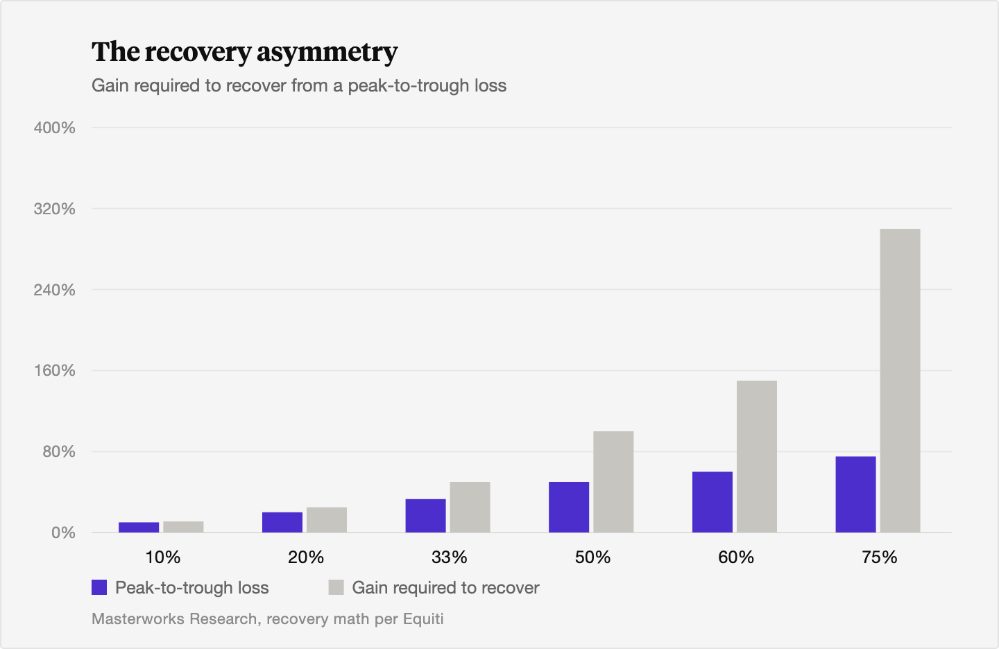
This is why we frame the art question the way we do. The point of a diversifier is not to predict the next crash. It is to lower the depth of the worst one.
2. Why art's near-zero correlation to equities is the mechanism
The case for art in a drawdown context runs through correlation, not return. Academic and institutional studies generally find that fine art price indices have low to near-zero correlation with US equities. A 2025 study in the Journal of International Financial Markets, Institutions and Money reports that art indices exhibit near-zero correlation with the S&P 500 in the short term, and that this holds across both crisis and non-crisis regimes [4]. Survey work on contemporary art versus the S&P 500 puts longer-horizon correlations generally in the 0.1 to 0.3 band, with extended periods where they are statistically indistinguishable from zero [9]. The legacy repeat-sale literature, including Mei and Moses, lands in the same place: art has lower volatility and lower correlation with other assets than earlier research had assumed, which is precisely what makes it useful for diversification [10][9].
Here is why that matters for the depth of a loss. The variance of a two-asset portfolio depends on each asset's own volatility plus a cross term that scales with their correlation. When the correlation between art and equities is close to zero, that cross term largely drops out, and the blended portfolio's volatility, and with it its drawdown, is driven mostly by the weighted average of the parts rather than by them moving together [9]. An asset that simply rose every time stocks fell would be a lucky hedge. Real diversification is owning something that is largely indifferent to the forces driving everything else. Art's highest correlation to anything is with gold, and even that runs only around 0.1 to 0.2. We unpack that relationship and where the two assets part ways in art versus gold as a hedge asset.
A note on how we measure this. The repeat-sale method tracks the same work across multiple sales rather than averaging a basket of different ones, the same approach Robert Shiller used to build the Case-Shiller home price index. When the same Warhol trades in 2018 and again in 2025, the change in price isolates real appreciation rather than a shift in what happened to sell. That construction is what lets us talk about art's correlation with any rigor at all.
3. How art behaved during the worst equity drawdowns: 2008, 2020, 2022
The cleanest test of a diversifier is what it did when stocks were in free fall. Three recent episodes give us three different stress conditions.
The 2008 to 2009 global financial crisis was the deepest. The S&P 500 fell about 57% peak-to-trough [3]. For a longer head-to-head on the two assets across full cycles, see art versus stocks over the last 30 years. Fine art fell too, but far less on the index: the Mei Moses art index declined roughly 27% from 2007 to 2009 [3]. The pain was uneven underneath that headline. Post-war and contemporary auction sales volume dropped about 69% from 2008 to 2009, and Impressionist and Modern volume fell about 45% [3], a reminder that turnover seizes up in a crisis even when index prices hold better than equities. Recovery was slower than the stock rebound and ran into 2011 to 2013 depending on the segment and measure [3]. That sequence of decline and multi-year repair is the same pattern we trace in how art market cycles work.
The 2020 COVID crash was the fastest. The S&P 500 fell roughly 34% from its February 19 high to its March 23 low [3]. Art did not see a comparable instant collapse. Transaction activity paused and the market leaned on online and private sales, with prices moving on a lag rather than crashing in lockstep [3]. The episode is a good illustration of art's own clock: it did not fall when stocks fell, and it did not snap back when stocks snapped back.
The 2022 bear market is the most instructive for a balanced investor, because stocks and bonds fell together. The S&P 500 dropped roughly 25% from its January 2022 high to its October low [3], and the traditional bond ballast that is supposed to cushion a 60/40 portfolio fell at the same time, producing one of the worst years on record for that mix. Art was comparatively defensive over the window, with slower liquidity and less immediate price discovery rather than an acute drawdown [3]. When the usual diversifier failed, an asset on a different clock did its job.
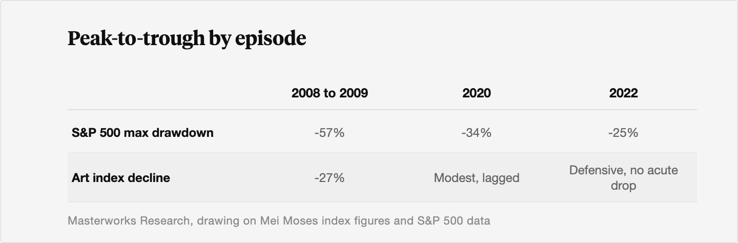
We will not overstate this. Art is not a safe haven that reliably spikes in a panic. The 2025 study is explicit that art does not qualify as a strong safe-haven asset [4]. What the record shows is shallower drawdowns and a different timing, which is what a diversifier is supposed to deliver.
4. What adding an art sleeve does to a blended portfolio's maximum drawdown
The portfolio effect follows directly from the correlation. Because art's correlation to equities sits near zero and its index drawdowns have been shallower than equities in the same episodes, mixing the two lowers the deepest combined loss relative to holding stocks alone.
A stylized example, consistent with the correlation and drawdown data, makes the size of it concrete. Take a severe equity-only drawdown of about 50%. Add a 20% art sleeve whose own drawdown over the same window is modest, say 5% to 10%, with near-zero correlation to the equity leg. The blended worst loss works out to roughly 0.8 times 50% plus 0.2 times 5% to 10%, or about 41% to 42% [9]. That is a reduction of roughly 8 to 9 percentage points in the deepest loss, purely from mixing in a lower-correlation, shallower-drawdown asset [9]. In the real 2008 to 2009 numbers, where art fell about 27% against the S&P 500's 57%, the cushioning would have been larger still.
The same low correlation that shrinks the drawdown also tends to lift risk-adjusted return. With plausible inputs, a 20% to 30% art allocation can cut a portfolio's annualized volatility by 1 to 3 percentage points while only modestly trimming expected return, which raises the Sharpe ratio by roughly 5% to 15% versus an all-equity book [9]. The mechanism is the same in both cases. You are not adding a higher-returning asset. You are adding one that does not move with the rest.
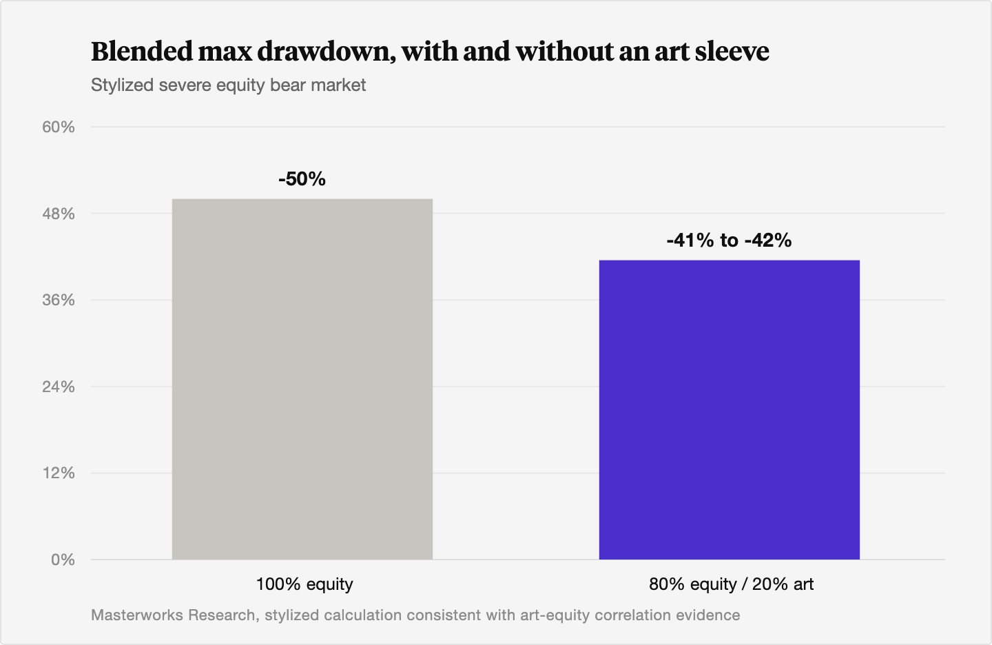
How much to hold is a separate question with a wide answer. Unconstrained mean-variance optimizations run on long historical samples have pushed art weights surprisingly high, in one 2017 study to 32% to 43%, lifting the modeled Sharpe ratio from 0.41 to 0.51 [11]. Those figures ignore liquidity, transaction costs, and capacity, and the same study finds art's edge shrinks sharply in post-1990 data [11]. Institutional practice lands far lower. Deloitte's Art and Finance work and most practitioner guidance treat art as a satellite allocation, commonly a single-digit share of investable assets [11]. We are in the latter camp. Treat art as a long-term, illiquid, small allocation, typically under 5% to start, held over a 3 to 10 year horizon. Drawdown protection is one job for that sleeve. We compare it against the other real assets investors reach for in inflation hedging: art versus gold versus real estate versus crypto.
5. The honest counterpoint: smoothing and illiquidity understate art's true risk
Any reader who has gotten this far should be skeptical of the clean numbers, and the skepticism is warranted. Art trades infrequently, and between sales its value is inferred from appraisals and comparable transactions. That structure smooths the reported return series, and smoothing mechanically understates volatility, correlation, and drawdown [12][13].
The mechanism is straightforward. A large true price shock does not show up as one sharp quarterly move in an appraisal-based series. It gets spread across several periods as appraisers adjust gradually, which shrinks measured quarterly variance, blurs the timing of co-movement with equities so contemporaneous correlation looks lower than it is, and makes peak-to-trough declines look smaller and slower than the underlying economics [12][13]. Appraised values are especially sticky on the way down, because appraisers are reluctant to mark to fire-sale prices. The CFA curriculum states the same plainly for appraisal-based real estate indices: lags smooth the index, reduce volatility, lower correlation with other assets, and overstate the Sharpe ratio [12].
There are well-established statistical fixes. The Geltner approach inverts the smoothing filter using the series' own autocorrelation. The Getmansky, Lo, and Makarov method, built for hedge funds in 2004, generalizes it to multi-period smoothing [14]. Applied to illiquid, appraisal-based assets, de-smoothing typically raises estimated annualized volatility by roughly 1.5x to 3x and lifts correlation to equities and other factors, sometimes pushing an apparent equity beta of 0.2 to 0.3 up toward 0.5 to 0.7 [12][13][14]. In commercial real estate, one study found quarterly return autocorrelation falling from about 0.72 to 0.02 once Geltner unsmoothing was applied, evidence that most of the apparent calm was an artifact [14]. For art specifically, practitioners who apply these adjustments commonly see annualized volatility move from the high single digits into the mid-teens, and equity correlation move from 0.1 to 0.2 up toward 0.3 to 0.5 [13][14].
What this means for the drawdown case is a matter of degree, not direction. Even after de-smoothing, art's correlation to equities stays well below 1, so the diversification benefit survives. But the unadjusted index drawdown is a floor on the true risk, not the whole of it. We would rather state that plainly than sell a smoothed number. The right reading of the data is that art lowers a blended portfolio's worst loss, by less than the raw indices imply, and still meaningfully.
The Bottom Line
- Maximum drawdown drives real investor outcomes because the recovery math is asymmetric and deep losses are where people quit. A 50% loss needs a 100% gain to recover [1].
- Art has shown roughly zero correlation to US equities over long periods, in the 0.0 to 0.3 range and often statistically indistinguishable from zero, which is the property that makes it a diversifier [4][9].
- In the 2008 to 2009 crisis the art index fell about 27% while the S&P 500 fell about 57%, and in 2022 art held up while stocks and bonds fell together [3].
- A stylized 80/20 stock-and-art mix turns a roughly 50% equity drawdown into about 41% to 42%, a reduction of 8 to 9 points, with a 5% to 15% lift in the Sharpe ratio [9].
- Art is illiquid and appraisal-smoothed, so reported drawdowns understate the truth. De-smoothing raises measured volatility by roughly 1.5x to 3x, though the diversification benefit holds after the adjustment [12][14].
- Past performance is not predictive, and none of this promises a return. The argument is about behavior in a downturn, held as a small, long-horizon allocation.
Sources
- Equiti. "Explained: how drawdown works in trading." Equiti, March 16, 2026. https://www.equiti.com/jo-en/news/trading-ideas/what-is-drawdown-in-trading-definition-calculation-and-risk-management/
- CFA Institute. "Sculpting Investment Portfolios: Maximum Drawdown and Optimal Portfolio Strategy." CFA Institute Inside Investing blog, February 12, 2013. https://blogs.cfainstitute.org/insideinvesting/2013/02/12/sculpting-investment-portfolios-maximum-drawdown-and-optimal-portfolio-strategy/
- Masterworks. "What Happens to Art During a Recession?" Masterworks Insights, updated April 16, 2026 (Mei Moses 2007 to 2009 decline of 27.2%, S&P 500 down 57%). https://insights.masterworks.com/alternative-investments/art-investing/what-happens-to-art-during-a-recession/
- "Analysing art as a safe-haven asset in times of crisis." Journal of International Financial Markets, Institutions and Money, 2025. https://www.sciencedirect.com/science/article/pii/S1057521925002819
- Artsy Editorial. "Why Certain Artists' Markets Can Weather a Recession While Others Flop." Artsy, October 11, 2018 (post-war and contemporary volume down 69% from 2008 to 2009). https://www.artsy.net/article/artsy-editorial-artists-markets-weather-recession-flop
- Guggenheim Investments. "Asset Class Correlation Map." Guggenheim Investments, updated June 11, 2026. https://www.guggenheiminvestments.com/advisor-resources/interactive-tools/asset-class-correlation-map
- AltStreet. "Luxury Asset Correlation Analysis: Stocks, Bonds, Real Estate." AltStreet, December 19, 2025 (fine wine versus S&P 500 down 18.1% in 2022). https://altstreet.investments/blog/luxury-asset-correlation-analysis-stocks-bonds-real-estate
- S&P Global. "The Dispersion-Correlation Map." S&P Dow Jones Indices, 2016 (S&P 500 down 38% in 2000 to 2002 and 37% in 2008). https://www.spglobal.com/spdji/en/documents/research/research-the-dispersion-correlation-map.pdf
- MoMAA. "Economic Correlation Analysis: Art Markets and Traditional Asset Class Performance Relationships." MoMAA, September 15, 2025 (36-month rolling correlations, 0.1 to 0.3 band). https://momaa.org/economic-correlation-analysis-art-markets-and-traditional-asset-class-performance-relationships-2/
- Mei, Jianping and Michael Moses. "Art as an Investment and the Underperformance of Masterpieces." American Economic Review 92(5), December 2002, 1656 to 1668. https://www.aeaweb.org/articles?id=10.1257%2F000282802762024719
- Anderson, Pownall et al. "Art as an Investment: A New Perspective." ICMAIF conference paper, May 2017 (optimal art weight 32% to 43%, Sharpe 0.41 to 0.51). https://icmaif.soc.uoc.gr/Year/2017/papers/Art_as_an_Investment_May2017.pdf
- AnalystPrep. "Real Estate Investment Indexes (CFA Level II): appraisal lags, smoothing, and unsmoothing." AnalystPrep, updated May 28, 2026. https://analystprep.com/study-notes/cfa-level-2/real-estate-investments-indexes/
- Klarphos. "Unsmoothing Private Markets." Klarphos, 2024 (AR(1) unsmoothing of private-market returns, 2002 to 2024). https://www.klarphos.com/news-insights/unsmoothing-private-markets
- Rossi, Andrea. "Unsmoothing Returns of Illiquid Assets." W.P. Carey School, Arizona State University, seminar paper, 2019 (Geltner unsmoothing; CRE autocorrelation 0.72 to 0.02). https://wpcarey.asu.edu/sites/g/files/litvpz246/files/2021-11/andrea_rossi_seminar_paper_november_1_2019.pdf
Disclosures
Investing involves risk. Past results are not indicative of future outcomes.
Masterworks is providing this communication as an agent for its issuer entities, not Masterworks Advisers. This material is produced by Masterworks for informational purposes only and does not constitute investment advice, a recommendation, or an offer or solicitation to buy or sell any security. Masterworks is not a licensed broker-dealer by the SEC or FINRA.
Masterworks can only make and accept sales after an offering statement has been filed, and "qualified", by the SEC. Any offers may be revoked before notice of qualification. Indications of interest involve no obligation. For further disclosure visit the offering documents filed with the SEC and Important Disclosures at masterworks.com/cd.
Forward-looking statements and internal estimates are based on assumptions that may prove incorrect, and actual outcomes may differ materially. Figures denoted in brackets are subject to confirmation. Investing in art and alternative assets involves risk, including loss of principal.
Art sales price data is comparative only. Each painting is unique and historical data is not a direct proxy for any specific painting or investment. Data represents whole art, not an investment into our offerings which includes fees and expenses. Any comparative images are not currently live offerings and are provided for educational purposes only.
Masterworks, LLC is located at 1 World Trade Center, 57th Floor, New York, NY 10007.


