Masterworks Research · June 2026
What the curve is, why it inverts, what its track record actually supports, and how a long-horizon allocator reads a cycle signal without trading an illiquid asset on it.
An inverted yield curve is the bond market pricing short-term interest rates above long-term ones, and it has preceded essentially every US recession since the late 1960s, usually by roughly 12 to 18 months. The signal forms because the Federal Reserve raises short rates to slow the economy while longer-dated yields fall as investors price in future rate cuts and slower growth. For an investor, the curve is one of the most studied leading indicators in markets. It is also a cycle and liquidity signal, which means it matters most to allocators who can act on it, and least to those holding assets they cannot trade on a 12-month view.
What You Need to Know
- The yield curve is the term structure of Treasury yields. It plots the interest rate the US government pays across maturities from 3 months to 30 years. Its normal shape slopes upward, because lenders usually demand more to tie up money for longer.
- Two spreads do most of the work. The 10-year minus 2-year spread is the popular one. The 10-year minus 3-month spread is the version the Federal Reserve and academic research tend to prefer, and it underpins the New York Fed's recession-probability model.
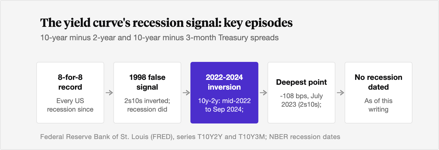
- The track record is real and the lag is long. Campbell Harvey, who identified the relationship in his 1986 Duke dissertation, counts an 8-for-8 record for his preferred 10-year minus 3-month measure, with no false signals. Lead times have run from about 6 to 24 months.
- The 2022 to 2024 inversion is the live test case. The 10-year minus 2-year curve stayed inverted from mid-2022 until September 2024, the longest stretch in roughly 45 years, reaching about -108 basis points in July 2023. No recession had been dated as of this writing, which has reopened the false-signal debate.
- Art does not trade on this signal. Fine art is a long-duration, illiquid real asset held through cycles. A patient allocator can read rate signals for context without trying to time a holding that takes years to enter and exit. We do not treat art as a recession hedge, and the data does not support framing it that way.
1. What the yield curve actually is
The yield curve is the term structure of interest rates: a plot of the yield on US Treasury securities against their time to maturity, from the 3-month bill out to the 30-year bond.[1] Because Treasuries carry effectively no default risk, the curve is the market's cleanest read on the price of time and the expected path of policy.
Its normal shape slopes upward. Investors usually require a higher yield to lend for ten years than for three months, both because more can go wrong over a decade and because they give up the option to redeploy cash. That extra compensation for holding longer-dated debt has a name we will come back to: the term premium.
When the slope flattens, the gap between long and short yields narrows toward zero. When it inverts, short yields rise above long yields and the curve slopes down. Inversion is the shape that draws attention, because it has a track record few other indicators can match.
2. The two spreads investors watch
In practice, "the yield curve" usually means one of two spreads.
The first is the 10-year minus 2-year spread, often written 2s10s. It is the one financial media quote most, partly because the 2-year note is a liquid, widely traded benchmark.[2] This is the measure that turned negative in 2022 and stayed there into 2024.
The second is the 10-year minus 3-month spread. The 3-month bill tracks the Federal Reserve's policy rate almost perfectly, so this version directly compares current short-term policy with the market's long-run expectations.[3] Academic work and the Federal Reserve itself tend to favor it. It is the spread behind the New York Fed's published recession-probability model, and the one Campbell Harvey built his original research around.[4][5]
The two usually move together, and both invert before downturns. They can diverge in timing and depth, which is why analysts watch both rather than picking one.
3. Why the curve inverts
An inversion is two forces meeting in the middle of the curve.
On the short end, the Federal Reserve raises its policy rate to cool an overheating economy or to fight inflation. The 3-month bill follows the policy rate up almost mechanically. On the long end, the 10-year yield reflects where investors think rates will average over the next decade. If the market believes today's high rates will slow growth enough that the Fed has to cut later, it prices those future cuts into long-dated yields now, pulling the 10-year down.[6]
Put the rising short end together with the falling long end and the curve crosses over. The inversion is the market saying, in effect, that current policy is tight enough that rates are more likely to fall than rise over the medium term, and that the cause will probably be a weaker economy.[3]
That is the clean version. The messier reality runs through the term premium.
4. The term premium, and why it complicates the signal
The term premium is the extra yield investors demand for holding a long-dated bond instead of rolling short-dated ones. It is not observed directly. It has to be estimated, most commonly with the Adrian, Crump, and Moench (ACM) model the New York Fed publishes, which separates a yield into an expected-policy-path piece and a term-premium piece.[7]
This matters for inversions. A 10-year yield can fall for two very different reasons: investors expect rate cuts (a genuine growth-and-policy signal), or the term premium has compressed (a technical, supply-and-demand effect that says little about the economy). The ACM 10-year term premium has swung from roughly -100 basis points to +400 basis points since 1990, and it sat deeply negative through much of the 2019 to 2023 period.[7]
When the term premium is very low or negative, the curve can invert without the market actually pricing a sharp downturn. The Richmond Fed has made this point directly: as the term premium falls, inversions become more likely even with no increase in recession risk.[8] So part of the debate over recent inversions is whether they reflected real recession fears or simply a structurally depressed term premium.
5. The track record as a recession signal
The case for watching the curve rests on a striking historical record.
Campbell Harvey identified the relationship between the yield curve and future growth in his 1986 Duke dissertation, supervised by Eugene Fama.[5] Using the 10-year minus 3-month spread, Harvey counts an 8-for-8 record: a sustained inversion has preceded every US recession since the late 1960s, with no false alarms on that specific measure.[4] The one exception people cite, the 1967 slowdown, was a near miss the model did not flag.[3]
The New York Fed turned this into a working forecast. In 1996, economists Arturo Estrella and Frederic Mishkin built a probit model that converts the 10-year minus 3-month spread into a probability of recession within the next 12 months.[3] Historically, readings above the 20 to 30 percent range have tended to precede downturns.
Two cautions sit alongside the record. First, the popular 2s10s spread is less clean than Harvey's 10-year minus 3-month measure. It gave a false signal in 1998 ahead of a recession that did not arrive on schedule.[4] Second, the lead time is both long and variable. Across cycles, the gap between inversion and recession has run from about 6 months to as long as 24 months, with a median for the 2s10s closer to 14 months.[2] A signal that can be early by two years is hard to trade on a near-term clock.
It also helps to remember who decides. A recession in the US is dated by the National Bureau of Economic Research, which calls it a significant decline in activity spread across the economy and lasting more than a few months, judged on depth, diffusion, and duration rather than a simple two-quarter GDP rule.[9] The curve forecasts something only the NBER can later confirm, often well after the fact.
6. The 2022 to 2024 inversion and what followed
The most recent episode is the reason this topic is live again.
The 10-year minus 2-year curve inverted in 2022 and stayed inverted until September 2024, when the 2-year yield finally dropped back below the 10-year.[2] On the 10-year minus 3-month measure, the 3-month bill yielded more than the 10-year note from late October 2022 until around December 2024.[3] By duration, this was the longest inversion in roughly 45 years. By depth, the 2s10s reached about -108 basis points in early July 2023, the most inverted reading since 1981.[10]
The economy did not follow the script. Through 2025, no recession had been dated. Growth held up, the Federal Reserve began cutting rates in late 2024, and the curve normalized as short yields fell faster than long ones.[2]
This is the false-signal debate in real time. One reading is that the signal failed, undone by a depressed term premium and an unusual post-pandemic cycle. Another, which Harvey himself has leaned toward, is that the conditions for a clean signal were partly absent, or that the lag simply ran toward the long end of its historical range.[4] Both readings share a lesson worth keeping. An indicator with a strong record is still a probability, not a promise, and a single cycle can stretch or break it.
7. How a long-horizon allocator reads a rate signal
Here is where the curve meets portfolio construction, and where we want to be careful.
The yield curve is a cycle and liquidity signal. It informs how an allocator thinks about the macro backdrop: where policy is in its arc, whether financial conditions are tightening, and how the cost of money is likely to move. Investors who can reposition on a 12-to-18-month view, by trading duration, rotating equity exposure, or holding cash, are the ones for whom the signal has direct, actionable value.
Fine art sits at the opposite end of that spectrum. It is a long-duration, illiquid real asset. Acquiring a work and later selling it can take years, transaction costs are meaningful, and there is no daily price to trade against. An allocator cannot move in and out of a painting on a macro signal the way they can with a Treasury position, and trying to would mean paying liquidity costs to chase a signal that can be early by two years.
So the honest framing is narrow. A patient allocator can read the curve for context, the same way they read inflation prints or Fed minutes, and let it shape the pace and timing of when they add to a long-term position. The curve does not tell you to buy or sell an illiquid holding. It tells you something about the cycle the holding will pass through.
We want to be explicit about what we are not claiming. We are not saying art is a recession hedge. The case for art in a portfolio rests on low long-run correlation to equities, which we put at roughly zero over long periods, with art's highest correlation, to gold, around 0.1 to 0.2.[11] Correlation is the point of diversification, the property of an asset moving to its own rhythm. That is a different and more durable claim than "art protects you in a downturn," and we think the distinction matters. Our work on how art market cycles work and art versus stocks over the last 30 years treats the art cycle on its own terms, driven by wealth at the very top and a slowly shrinking supply of blue-chip works, rather than as a mirror of the rate cycle.
For more on why real assets enter the conversation when the macro backdrop shifts, see our notes on fiscal dominance and hard assets and on art in a deflationary environment and Japan's lost decade.
The Bottom Line
- The yield curve is the term structure of Treasury yields. Its normal shape slopes upward, a flat curve signals uncertainty about the policy path, and an inversion has short rates above long rates.
- Two spreads dominate the conversation. The 10-year minus 2-year is the popular benchmark, and the 10-year minus 3-month is the version the Federal Reserve and academic research prefer.
- An inversion is the bond market pricing tight current policy against expected future rate cuts, complicated by an unobservable term premium that can invert the curve on its own.
- The signal has preceded essentially every US recession since the late 1960s, but with long and variable lead times of roughly 6 to 24 months, which makes it a probability rather than a clock.
- The 2022 to 2024 inversion was the longest in about 45 years and was not followed by a dated recession as of this writing, which has revived the false-signal debate.
- For a long-horizon allocator, the curve is useful context for the cycle, not a trade signal for an illiquid asset. We do not treat art as a recession hedge. Its case rests on low long-run correlation, not on downside protection.
Sources
- Federal Reserve Bank of Chicago. "Why Does the Yield-Curve Slope Predict Recessions?" Chicago Fed Letter No. 404, 2018. https://www.chicagofed.org/publications/chicago-fed-letter/2018/404
- CNN Business. "The most well-known recession indicator stopped flashing red, but now another one is going off." September 13, 2024. https://www.cnn.com/2024/09/13/economy/inverted-treasury-yield-recession-indicator/index.html
- Federal Reserve Bank of San Francisco. "Current Recession Risk According to the Yield Curve." Economic Letter, May 2022. https://www.frbsf.org/research-and-insights/publications/economic-letter/2022/05/current-recession-risk-according-to-yield-curve/
- Duke University, Fuqua School of Business. "Why the Yield Curve Isn't Predicting Recession (Yet)." Duke Fuqua Insights (Campbell Harvey). https://www.fuqua.duke.edu/duke-fuqua-insights/harvey-yield-curve
- Campbell R. Harvey. "The Yield Curve and Future Economic Growth." Duke University. https://people.duke.edu/~charvey/Term_structure/Harvey.pdf
- Federal Reserve Bank of Richmond. "Have Yield Curve Inversions Become More Likely?" Economic Brief 18-12, December 2018. https://www.richmondfed.org/publications/research/economic_brief/2018/eb_18-12
- MacroMicro. "US ACM 10Y Treasury Term Premium Estimates" (Adrian, Crump, and Moench model, FRBNY). https://en.macromicro.me/charts/45452/us-10-treasury-term-premium
- Federal Reserve Bank of Richmond. "Have Yield Curve Inversions Become More Likely?" Economic Brief 18-12, December 2018. https://www.richmondfed.org/publications/research/economic_brief/2018/eb_18-12
- National Bureau of Economic Research. "Business Cycle Dating Procedure: Frequently Asked Questions." https://www.nber.org/research/business-cycle-dating/business-cycle-dating-procedure-frequently-asked-questions
- Reuters / Yahoo Finance. "EXPLAINER: U.S. yield curve hits deepest inversion since 1981: What is it telling us?" July 2023. https://finance.yahoo.com/news/explainer-u-yield-curve-hits-182731416.html
- Federal Reserve Bank of St. Louis (FRED). "10-Year Treasury Constant Maturity Minus 2-Year Treasury Constant Maturity (T10Y2Y)." https://fred.stlouisfed.org/series/T10Y2Y
Disclosures
Investing involves risk. Past results are not indicative of future outcomes.
Masterworks is providing this communication as an agent for its issuer entities, not Masterworks Advisers. This material is produced by Masterworks for informational purposes only and does not constitute investment advice, a recommendation, or an offer or solicitation to buy or sell any security. Masterworks is not a licensed broker-dealer by the SEC or FINRA.
Masterworks can only make and accept sales after an offering statement has been filed, and "qualified", by the SEC. Any offers may be revoked before notice of qualification. Indications of interest involve no obligation. For further disclosure visit the offering documents filed with the SEC and Important Disclosures at masterworks.com/cd.
Forward-looking statements and internal estimates are based on assumptions that may prove incorrect, and actual outcomes may differ materially. Figures denoted in brackets are subject to confirmation. Investing in art and alternative assets involves risk, including loss of principal.
Art sales price data is comparative only. Each painting is unique and historical data is not a direct proxy for any specific painting or investment. Data represents whole art, not an investment into our offerings which includes fees and expenses. Any comparative images are not currently live offerings and are provided for educational purposes only.
Masterworks, LLC is located at 1 World Trade Center, 57th Floor, New York, NY 10007.