Masterworks Research · June 2026
What the Sharpe ratio measures, how to read it, and why illiquid assets like art demand de-smoothed, selection-corrected numbers before the comparison is fair.
The Sharpe ratio measures how much return an investment earns above the risk-free rate for each unit of volatility it takes on. You calculate it by subtracting the risk-free rate from the portfolio's return and dividing by the standard deviation of those returns. [1] A higher number means more reward per unit of risk. The metric matters to investors because a raw return tells you nothing about the ride that produced it, and two assets with the same return can carry very different amounts of risk. For illiquid assets like art, the Sharpe ratio also carries a trap: the way returns are measured can make the number look far better than it really is, and we think that is worth understanding before you compare art to anything else.
What You Need to Know
- The Sharpe ratio is excess return divided by volatility. William F. Sharpe introduced it in 1966 as the "reward-to-variability ratio." [1][3] The formula is the portfolio return minus the risk-free rate, divided by the standard deviation of returns.
- Reading it is straightforward. As a rule of thumb, below 1.0 is subpar, 1.0 to 2.0 is acceptable to good, 2.0 to 3.0 is very good, and above 3.0 is excellent. [2][4] Over long horizons, US equities sit around 0.4 to 0.6 and a 60/40 portfolio around 0.5 to 0.7. [5]
- The Sortino and information ratios refine the same idea. Sortino divides by downside deviation only, so upside swings are not penalized. [6][7] The information ratio divides active return over a benchmark by tracking error. [7]
- Illiquid assets break the math in two ways. Appraisal-based valuations smooth reported returns, which understates volatility and inflates the ratio. [8] Sample selection bias inflates the measured return on top of that. [9]
- For art, correcting both pulls the ratio down hard. Academic work that corrected art returns for selection cut the annual Sharpe ratio from about 0.27 to about 0.11. [9] Judge art's risk-adjusted return on numbers that have been cleaned up the same way.
1. What the Sharpe ratio actually measures
Start with the problem it was built to solve. A return on its own is incomplete. If one fund returned 10% by holding Treasuries and another returned 10% by trading volatile small-caps, the two are not the same investment, and the headline number hides the difference. The Sharpe ratio puts both on a common footing by asking how much return each earned for the risk it carried.
The calculation is simple. Take the asset's return, subtract the risk-free rate (usually short-term Treasury bills, the return you could earn with effectively no risk), and divide the result by the standard deviation of the asset's returns. [1] Standard deviation is the statistical measure of how much returns bounce around their average, so it stands in for risk. The numerator is the reward. The denominator is the variability. The ratio is reward per unit of variability.
The metric comes from William F. Sharpe, who introduced it in 1966 and originally called it the "reward-to-variability ratio." [1][3] Sharpe went on to win the 1990 Nobel Memorial Prize in Economic Sciences, shared with Harry Markowitz and Merton Miller, for his work on the Capital Asset Pricing Model. [1] The ratio that carries his name has become the default way investors compare risk-adjusted performance across funds, strategies, and whole asset classes.
One feature is worth flagging early, because it matters for everything that follows. Standard deviation treats every deviation from the average the same, whether the return surprised you on the upside or the downside. The math penalizes a good month and a bad month identically. That symmetry is clean and it is also the seam where the other ratios, and most of the trouble with illiquid assets, enter.
2. How to read a Sharpe ratio
The number is unitless, so it only means something in comparison. Practitioners use a rough scale. A Sharpe ratio below 1.0 is generally seen as subpar, 1.0 to 2.0 as acceptable to good, 2.0 to 3.0 as very good, and above 3.0 as excellent. [2][4] These bands are conventions, not laws, and they assume the underlying returns were measured honestly. Hold that assumption in mind. We will come back to it.
More useful than the bands are the long-run figures for asset classes you already know. Over multi-decade horizons, the broad US stock market has a Sharpe ratio commonly cited around 0.4 to 0.6, with 0.4 to 0.5 the most quoted band. [5] US Treasuries land around 0.2 to 0.4, a classic 60/40 stock-and-bond portfolio around 0.5 to 0.7 (diversification lowers the volatility faster than it lowers the return), and gold around 0.1 to 0.3. [5] Broad hedge fund indices fall roughly in the 0.4 to 0.7 range. [5]
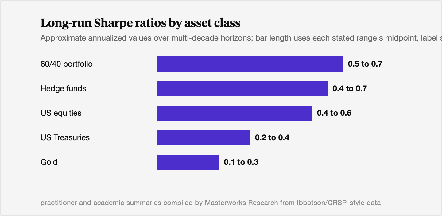
Two lessons fall out of those numbers. First, almost nothing earns a long-run Sharpe ratio above 1.0. When a strategy advertises a Sharpe of 2 or 3 over many years, the right reflex is to ask how the volatility was measured before you believe the skill. Second, the bands tell you how rare a genuinely high risk-adjusted return is, which is exactly why a smoothed or selectively measured number stands out. It looks like skill. Often it is measurement.
3. The Sortino ratio and the information ratio
The Sharpe ratio has two well-known cousins, each built to fix something the original leaves out.
The Sortino ratio addresses the symmetry problem. It keeps the same shape, excess return on top, a risk measure on the bottom, but it replaces total standard deviation with downside deviation, which counts only the returns that fall below a target. [6][7] The target is often the risk-free rate or a minimum acceptable return. The logic is that investors do not lose sleep over a portfolio that jumps 20% in a good month. They worry about losses. Penalizing upside volatility the way the Sharpe ratio does treats a windfall as if it were a risk. The Sortino ratio, named for Frank Sortino of the Pension Research Institute, who developed it in the early 1980s, only counts the bad volatility. [6][7] CFA Institute frames it as a measure of "excess return to the risk of not meeting an investor's minimum acceptable return." [6] It is most useful for assets with lopsided return distributions, where a few large gains would otherwise inflate the standard deviation and unfairly drag the Sharpe ratio down.
The information ratio answers a different question: how good is a manager relative to a benchmark? It divides active return, the portfolio's return minus the benchmark's return, by tracking error, the volatility of that difference. [7] In plain terms, it asks how much extra return a manager delivered for each unit of deviation from the index they are measured against. A passive index fund has an information ratio near zero by construction. A skilled active manager who beats the benchmark consistently, without straying wildly from it, scores high. The Sharpe ratio judges an investment against cash. The information ratio judges a manager against the index they could have just bought instead.
For most investors comparing whole asset classes, the Sharpe ratio remains the workhorse. The other two sharpen specific questions: Sortino when the return distribution is asymmetric, the information ratio when you are paying for active management.
4. The Sharpe ratio and illiquid assets like art
Here is where the metric needs real care. The Sharpe ratio quietly assumes that reported returns are measured cleanly, frequently, and from a representative sample. For liquid assets that trade every day on a screen, that assumption mostly holds. For illiquid assets, private equity, private real estate, certain hedge fund strategies, and art, it does not, and the ratio gets flattered in two distinct ways. We think both pitfalls are worth stating plainly, because they push in the same direction. They make the number look better than the asset is.
Pitfall one: appraisal smoothing understates volatility
Illiquid assets do not have a continuous market price. Between rare transactions, their value is estimated by appraisal or model. Those estimates lag and underreact to what is actually happening, so the reported value moves more slowly and more gently than the true economic value. [8] Researchers call this return smoothing or appraisal smoothing. The reported return series looks calm because the appraisals are sticky, not because the asset is actually low risk.
The consequence runs straight through the Sharpe ratio. Smoothing suppresses the measured standard deviation, the denominator, while leaving the average return, the numerator, largely untouched. A smaller denominator with the same numerator produces a larger ratio. [8] The reported returns also show positive serial correlation, meaning one period's reported return predicts the next, a statistical fingerprint of smoothing that a liquid, mark-to-market asset would not leave. The classic academic treatment is Getmansky, Lo, and Makarov (2004), who showed that illiquidity and discretionary pricing generate exactly this serial correlation in hedge fund returns and inflate their Sharpe ratios. [8]
The fix is de-smoothing, also called unsmoothing. You model the smoothing process, strip it out, and recover a return series that swings the way the true economic value swings. When researchers do this to illiquid funds, measured volatility rises substantially, often well above the reported figure, and the Sharpe ratio falls, sometimes from outstanding to ordinary. [8] An appraisal-based art index built by interpolating between sparse auction sales has the same problem. The calm in the line is partly real and partly the appraiser's pencil.
Pitfall two: sample selection bias inflates the measured return
The second pitfall sits in the numerator. Repeat-sales indices for art, which track the same work across two or more sales, can only use works that actually sold more than once. Whether a painting comes back to auction is a choice the owner makes, and that choice is not random. Owners are more likely to resell works that have appreciated and to hold the ones that have not, so the works that enter the index skew toward winners. [9] The index then reports the return on the winners and presents it as the return on art. We walk through this mechanism in detail in how sample selection bias distorts published art returns.
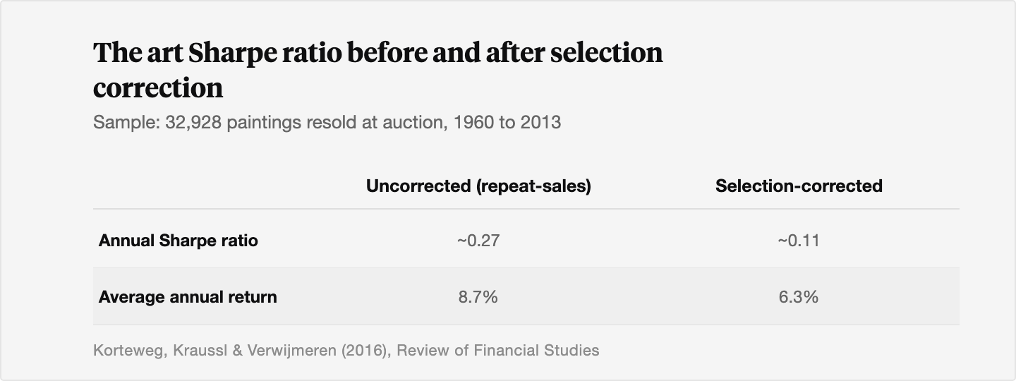
This is not a small adjustment. Arthur Korteweg, Roman Kraussl, and Patrick Verwijmeren, writing in the Review of Financial Studies in 2016, studied 32,928 paintings that resold at auction between 1960 and 2013 and built a model that corrects for the selection. [9] Correcting for it cut the average annual art return from 8.7% to 6.3%. [9] On the same data, normalizing both indices to 100 in 1960, the uncorrected index reached 5,429 by 2013 while the selection-corrected index reached only 1,895. [9] That is the same artworks, the same period, and a very different story depending on whether you account for which works chose to show up.
Putting both together
Now combine the two. Smoothing makes the denominator too small. Selection makes the numerator too big. Both inflate the Sharpe ratio, and for art they compound. In the same study, correcting for selection cut the annual art Sharpe ratio from about 0.27 to about 0.11, a drop of roughly 60%. [9] At 0.11, the authors found that a standard mean-variance investor would optimally hold zero art, where the uncorrected 0.27 had implied a meaningful allocation. [9] The honest number changed the conclusion.
We say this not to talk anyone out of art. We say it because it is the same scrutiny we apply to our own work. When we evaluate an artist market, we care about the appreciation rate divided by the volatility, a Sharpe ratio at the level of the individual market, and a number that has not been cleaned for smoothing and selection is not one we would trust. The discipline is to judge art's risk-adjusted return on de-smoothed, selection-corrected figures, then compare it to a liquid asset's clean figure. A corrected art Sharpe next to a clean equity Sharpe is a fair comparison. An uncorrected art Sharpe next to the S&P is not. Past performance, corrected or not, is not predictive of future results.
5. Where art still earns its place
A lower honest Sharpe ratio does not close the case for art, because the Sharpe ratio is a single-asset number and a portfolio is more than a single asset. The reason to hold art is that it moves to its own rhythm. Its correlation to equities over long periods is roughly zero, and its highest correlation, with gold, runs only around 0.1 to 0.2. An asset that is largely indifferent to whatever is driving stocks can lower the volatility of the whole portfolio even when its standalone Sharpe ratio is modest, which can lift the portfolio's Sharpe ratio above the sum of its parts. We look at how that plays out during equity sell-offs in art's impact on portfolio drawdowns, and we lay out how an advisor might size the allocation in art as an alternative allocation.
The point of measuring honestly is to make that diversification case on real numbers rather than flattered ones. For a side-by-side on the standalone return comparison, measured on the same basis, see art vs stocks over the last 30 years. Treat art as a long-term, illiquid allocation, judge it on corrected statistics, and let it do the job it is actually good at.
The Bottom Line
- The Sharpe ratio is excess return over the risk-free rate divided by volatility, and it lets you compare investments on a risk-adjusted basis instead of headline return alone.
- As a guide, below 1.0 is subpar and above 3.0 is excellent, but almost nothing earns a long-run Sharpe above 1.0, so an advertised high number deserves scrutiny of how the volatility was measured.
- The Sortino ratio penalizes only downside volatility, and the information ratio measures a manager's return against a benchmark per unit of tracking error.
- For illiquid assets, appraisal smoothing understates volatility and inflates the ratio, and de-smoothing the returns lowers it.
- For art specifically, sample selection bias inflates the measured return, and correcting for it cut the academic art Sharpe ratio from about 0.27 to about 0.11.
- Judge art's risk-adjusted return on de-smoothed, selection-corrected numbers, and remember that past performance is not predictive of future results.
Sources
- Investopedia. "Sharpe Ratio: Definition, Formula, and Examples." Investopedia, updated January 27, 2024. https://www.investopedia.com/terms/s/sharperatio.asp
- Wall Street Prep. "Sharpe Ratio." Wall Street Prep Knowledge, 2024. https://www.wallstreetprep.com/knowledge/sharpe-ratio/
- Sharpe, William F. "The Sharpe Ratio." Stanford University, reproduced from the Journal of Portfolio Management, Fall 1994. https://web.stanford.edu/~wfsharpe/art/sr/sr.htm
- CMC Markets. "What is the Sharpe Ratio?" CMC Markets, 2024. https://www.cmcmarkets.com/en-gb/fundamental-analysis/what-is-the-sharpe-ratio
- Charles Schwab. "How to Calculate the Sharpe Ratio to Gauge Risk." Schwab Learning Center, 2024. https://www.schwab.com/learn/story/calculate-sharpe-ratio-to-gauge-risk
- CFA Institute. "The Sortino Ratio." CFA Institute (GIPS / RPC), 2024. https://rpc.cfainstitute.org/sites/default/files/-/media/documents/code/gips/the-sortino-ratio.pdf
- Rollinger, Thomas N., and Scott T. Hoffman. "Sortino: A Sharper Ratio." CME Group, 2023. https://www.cmegroup.com/education/files/rr-sortino-a-sharper-ratio.pdf
- Swedroe, Larry. "Misrepresenting the Risks of Illiquid Funds." Larry Swedroe (Substack), summarizing Couts, Goncalves & Rossi, "Unsmoothing Returns of Illiquid Funds," and Getmansky, Lo & Makarov (2004), 2024. https://larryswedroe.substack.com/p/mispresenting-the-risks-of-illiquid
- Korteweg, Arthur, Roman Kraussl, and Patrick Verwijmeren. "Does it Pay to Invest in Art? A Selection-Corrected Returns Perspective." The Review of Financial Studies, Volume 29, Issue 4, pages 1007 to 1038, 2016. https://ideas.repec.org/a/oup/rfinst/v29y2016i4p1007-1038..html
- Korteweg, Arthur, Roman Kraussl, and Patrick Verwijmeren. "Does it Pay to Invest in Art? A Selection-Corrected Returns Perspective." SSRN working paper, 2016. https://papers.ssrn.com/sol3/papers.cfm?abstract_id=2280099
- Erasmus University Rotterdam. "Does it Pay to Invest in Art? A Selection-Corrected Returns Perspective." Pure.eur.nl publication record, 2016. https://pure.eur.nl/en/publications/does-it-pay-to-invest-in-art-a-selection-corrected-returns-perspe/
- Investopedia. "Limitations of the Sharpe Ratio." Investopedia, 2024. https://www.investopedia.com/articles/07/sharperatio.asp
Disclosures
Investing involves risk. Past results are not indicative of future outcomes.
Masterworks is providing this communication as an agent for its issuer entities, not Masterworks Advisers. This material is produced by Masterworks for informational purposes only and does not constitute investment advice, a recommendation, or an offer or solicitation to buy or sell any security. Masterworks is not a licensed broker-dealer by the SEC or FINRA.
Masterworks can only make and accept sales after an offering statement has been filed, and "qualified", by the SEC. Any offers may be revoked before notice of qualification. Indications of interest involve no obligation. For further disclosure visit the offering documents filed with the SEC and Important Disclosures at masterworks.com/cd.
Forward-looking statements and internal estimates are based on assumptions that may prove incorrect, and actual outcomes may differ materially. Figures denoted in brackets are subject to confirmation. Investing in art and alternative assets involves risk, including loss of principal.
Art sales price data is comparative only. Each painting is unique and historical data is not a direct proxy for any specific painting or investment. Data represents whole art, not an investment into our offerings which includes fees and expenses. Any comparative images are not currently live offerings and are provided for educational purposes only.
Masterworks, LLC is located at 1 World Trade Center, 57th Floor, New York, NY 10007.